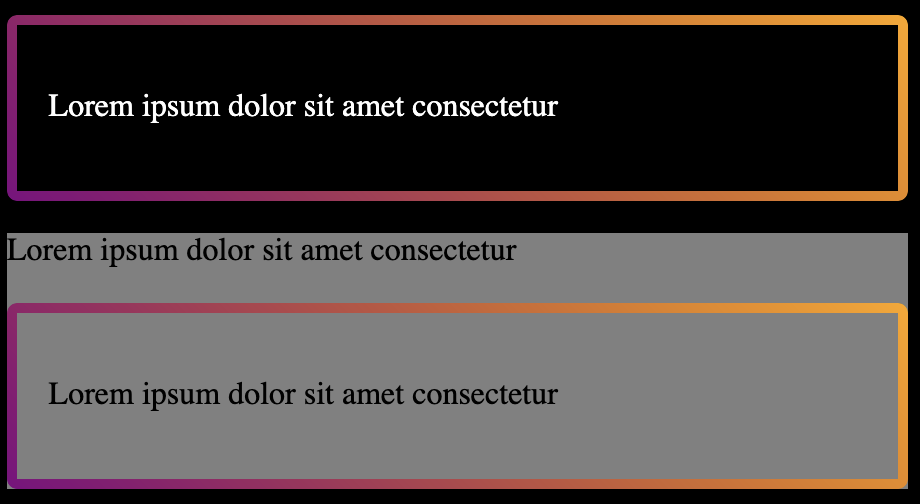
<html lang="en">
<head>
<title>Gradient borders with transparent background</title>
<meta charset="utf-8">
<style>
* {
  box-sizing: border-box;
}

body {
  background-color: black;
  color: white;
}

.card {
  background-color: gray;
  color: black;
}

.gradient-border-mask {
  display: flow-root;
  position: relative;
  padding: 1.3rem;
}

.gradient-border-mask::before {
  content: "";
  position: absolute;
  top: 0;
  left: 0;
  right: 0;
  bottom: 0;
  border-radius: 5px;
  border: 5px solid transparent;
  background: linear-gradient(45deg, purple, orange) border-box;
  -webkit-mask: linear-gradient(#fff 0 0) padding-box, linear-gradient(#fff 0 0);
  -webkit-mask-composite: destination-out;
  mask-composite: exclude;
}
</style>

</head>
<body>

<div class="gradient-border-mask">
  <p>Lorem ipsum dolor sit amet consectetur</p>
</div>

<div class="card">
  <p>Lorem ipsum dolor sit amet consectetur</p>
  <div class="gradient-border-mask">
    <p>Lorem ipsum dolor sit amet consectetur</p>
  </div>
</div>

</body>
</html>